
Anyone who has worked in digital analytics will tell you that day over day performance can be volatile. Shifts in marketing mix can cause fluctuating e-commerce conversion rates, new feature launches can lead to sudden and temporary swings in engagement rates and onsite bugs can result in anomalies in abandonment rates. Some of these scenarios can be diagnosed through extensive segmentation of data. Others, like a dropped analytics snippet or a bug with your payment processor, cannot be so easily uncovered. The simplest thing to do when events like these take place is to take a mental note and count on your memory for when you inevitably have to revisit that data in the future. Unfortunately, taking a mental note isn’t a scalable solution.
While it’s not the most thrilling task for a data team, keeping a record of the online and offline events that affect your business is a practice that is well worth the (small) time investment.
Examples of common failures:
- You are tasked with evaluating the success of a recent marketing campaign and decide to generate a benchmark for comparison using historical data. You fail to account for a major initiative that took place during your ‘pre’ period and you circulate an evaluation and recommended next steps that are not sound.
- A company executive sees a graph displaying month over month e-commerce conversion rate and asks you to diagnose a shift in performance (read: a dip in performance). You can’t recall all of the events that occurred around the start of the dip and you find yourself going down a rabbit hole trying to make sense of the shift in performance.
- A new member joins the Analytics team and gets started on their first analysis. They can’t be expected to remember major events that they weren’t there to experience so they ultimately send out a flawed analysis. Similarly, a veteran employee who was there to experience major events leaves the organization without sharing their domain knowledge with the rest of the team.
In this post I will walk through the steps I take to integrate annotations into my data models and visualizations. This is one technique for adding context to your data and inciting a better understanding of performance trends across your organization.
I will refer to an imaginary home goods e-commerce company called “Utensell” to guide the walkthrough.
Step 1: Whenever something notable happens, record it in a google spreadsheet. Easy!
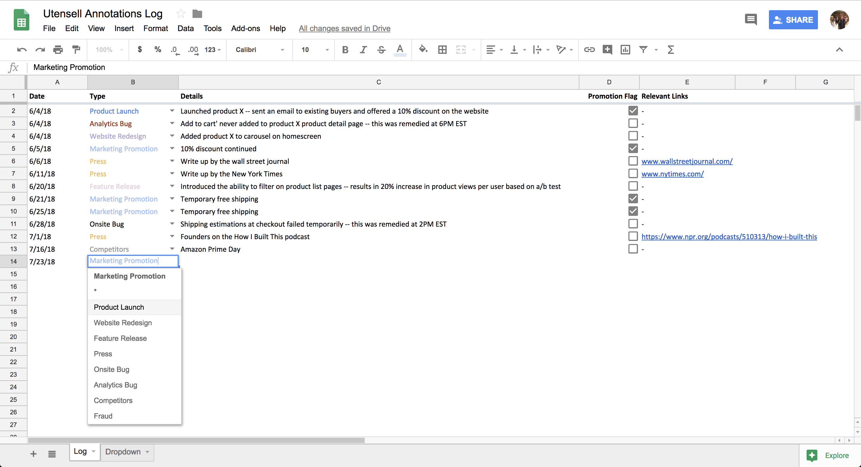
Examples of things I keep note of:
- Product Launches (e.g., launched new silverware SKU)
- Marketing Promotions – both online and offline (e.g., pulled back on marketing spend temporarily)
- Feature Releases (e.g., Utensell introduced filtering functionality to our products page)
- Press (e.g., Utensell founders featured on the How I Built This podcast)
- Onsite Bugs (e.g., new users were not able to sign up for the Utensell newsletter)
- Analytics Bugs (e.g., accidentally stopped capturing clicks on the “remove item” button in checkout)
- Competitors Behavior (e.g., Amazon prime day)
- Fraud (e.g., surge in bot traffic)
Depending on the business, it may make sense to keep note of some additional metadata. In this example, I have a boolean flag to indicate whether there was a discount promotion associated with the event. I also keep track of links that are relevant to the notable event (e.g., links to press articles) in a separate column.
Daily Time Spent: I generally spend 1-5 minutes per day on this step.
Step 2: Automate the formatting and uploading of your annotations log to your database.
I use the datasheets python library (created by the Engineering team at Squarespace) to reformat and upload my annotations log table into Utensell’s data warehouse. But you can use any method you prefer! (Quick shoutout to Rujuta Kortikar, who built V1 of this script using the gspread library before datasheets was released).
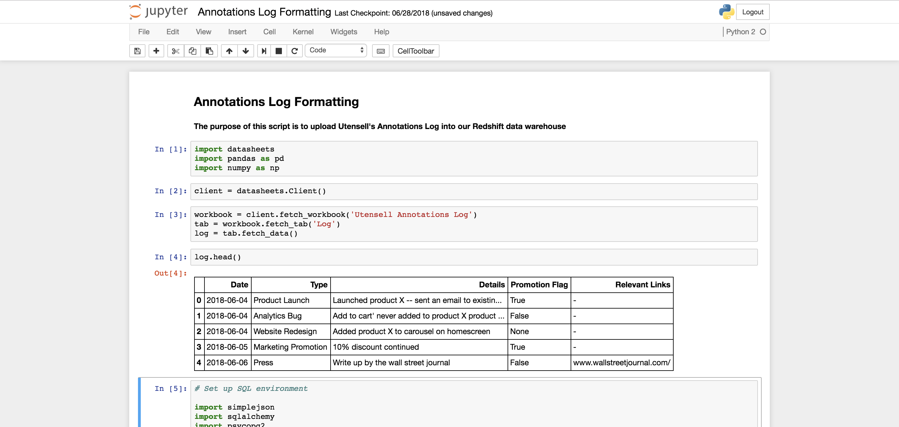
Daily Time Spent: This script runs automatically in Airflow so I don’t spend any time on this step anymore but the initial setup took around 3 hours.
Step 3: Reference your annotations log whenever and wherever you’d like!
Let’s imagine that I want to run an analysis that looks at daily orders data for the past 7 days. Knowing that discount promotions lead to big spikes in order volume, I may want to incorporate that information into my analysis. One way to achieve this would be to join my annotations log table to my order facts table. Example below:
SELECT
 orders.created_at AS order_created_date,
 CASE
   WHEN annotations.discount_promotion_flag IS TRUE
       THEN 'Discount Promotion'
   ELSE 'No Promotion'
 END AS discount_promotion_flag,
 COUNT(DISTINCT orders.id) AS total_orders
FROM utensell_order_facts AS orders
LEFT JOIN utensell_annotations_log AS annotations
   ON annotations.date = date(orders.created_at)
WHERE orders.created_at >= dateadd(day, -6, getdate()) AND orders.created_at <= getdate()
GROUP BY 1,2
ORDER BY 1;
The output for this query would look something like this:
| order_created_date | discount_promotion_flag | total_orders |
|---|---|---|
| 7/17/18 | No Promotion | 145 |
| 7/18/18 | Discount Promotion | 475 |
| 7/19/18 | Discount Promotion | 346 |
| 7/20/18 | No Promotion | 135 |
| 7/21/18 | No Promotion | 127 |
| 7/22/18 | No Promotion | 173 |
| 7/23/18 | Discount Promotion | 346 |
Now I can easily see a correlation between order volume and discount promotions. With that knowledge, I may decide to add a where clause that excludes dates when a discount promotion ran.
As another example, imagine that I have a daily dashboard in my business intelligence tool (in this case, Looker) that gets emailed company-wide with a chart that looks like this:
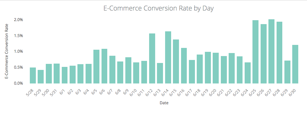
In this visualization, I immediately see some unexplainable ups and downs in the data. I can already predict the question my teammates will ask when they see this data – “what happened around the 25th of June that caused such a big spike in conversion rate?”.
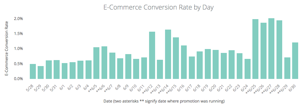
With the annotations log data, I can now get ahead of their question and add that layer of context onto the visualization. One option for achieving this would be to pivot on the ‘is promotional date’ dimension:

Or simply add an asterisk to the x-axis labels where promotions were running:
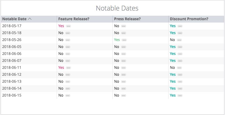
Finally, I might just want to simply include a table with notable dates directly at the bottom of a dashboard. That way, when business users notice data anomalies, they can quickly cross reference a list of notable dates to diagnose the cause.
Some challenges to consider before adopting this process:
- Compared to other data best practices, keeping an annotations log is a pretty manual process that requires you stay plugged into all of the areas of the business
- If the annotations log has multiple contributors (vs. one owner) you may run into some inconsistencies with nomenclature and / or notable events that were missed completely or added twice
Sometimes numbers speak for themselves. Other times, they need a little context.