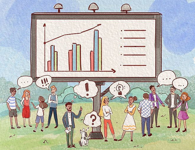
Proactively sharing data insights broadly with the people in our organizations encourages engagement and collaboration, brings additional visibility to the data team, and provides a way to work in partnership with others in the company to increase data literacy and create opportunities for a deeper understanding of the business.
As members of a data team, we’re poking around in the data all day long, and as such are in the best place to encounter intriguing trends and phenomena that no one else knows to ask about yet. Pursuing these can often lead to valuable discoveries that might have otherwise been missed.
I work on the Data Team at Netlify, and we carve out a few hours each week to dig around in the data and surface proactive insights. We’re also able to expand the impact of the work already being done for our stakeholders by simply communicating more widely. For example, when asked to do an analysis for the marketing team, we share the results with everyone to give other folks in the company information they can synthesize and use to inform their own work.
Broadly sharing these insights, both those that come from answering stakeholder questions and those discovered when exploring the data on our own, can be beneficial in a variety of ways:
- Helping folks understand a more comprehensive universe of questions that can be answered by our data
- Teaching others in our company about how to interpret data
- Serving as an entry point to existing reporting (e.g. “check out this great insight – and there’s so much more in this dashboard!”)
- Providing cross-functional visibility into analyses that might otherwise stay siloed
- Telling meaningful stories about the business
- Prompting conversations where business experts weigh in to provide more color
- Making the data team more visible and showing the range of the data team’s skills, far beyond a simple data pull
At Netlify, we have a Slack channel made for proactively sharing insights, called #internal-stats-n-graphs. Slack works well for this because this is our communication norm. Each of the data analysts and analytics engineers on the Data Team aim to develop an insight weekly, then we schedule out who will post in the channel each day. The goal is to post one or two insights daily Monday through Thursday, as that’s when folks are most likely to see and engage with what we post.
Anyone from the company can post in the channel, which keeps it lively and adds to the collaborative spirit. Often there will be an interleaving of Data Team-produced insights with pictures of observability graphs that look like works of modern art, or a chart that tells a satisfying story of a clean platform migration.
Sharing insights in this way can, by itself, be valuable (see the bullet points above), but there’s a really interesting thing that starts to happen when people engage with the insight and ask or answer questions about it in the Slack thread. Those conversations can yield great ideas for future explorations, cross-functional connections that lead to valuable partnerships, opportunities to educate about data interpretation best practices, and ways for us on the data team to learn about aspects of the business from subject matter experts that can help us refine our explorations. We want people to learn something from the insight, and we also want them to seize the opportunity to learn even more by engaging in conversation about it, or by reading the conversation others are having about it.
But to drive this collaboration and engagement with the data, there’s more to it than plopping in a link to a dashboard with a “hey, check this out!”
After some trial and error, the Netlify Data Team learned to do some things that work well for sharing an insight and engaging our colleagues. We lead with a handful of bullet points highlighting the key takeaways, include a high-quality visualization, and encourage further exploration and discussion.
Here’s an example of how we format these insight posts, which I’ll break down in the following section!
____________________________________________________________________________
📊 Fresh Insights about How My Cat Wakes Me Up! 📊
- On average, my cat is drooling, purring, or doing both at the same time, 48% of the time when he steps on my face
- January was a big month for my cat stepping on my face. An increase of 16% over December! He started off 2021 with a bang
- There was a drop in the overall # of times my cat stepped on my face in February. This may be due to fewer days in February
- A low average range of last feeding time reflects consistency in the timing of when my cat gets fed at night. The months we stuck to a strict nighttime feeding schedule reduced the overall # of face-stepping incidents
- However, the # of incidents involving purring and drooling appear to stay steady regardless of the strictness of the feeding schedule
- While the non-drooling/non-purring face-stepping incidents may be motivated by hunger due to an inconsistent feeding schedule, the inclusion of purring and drooling may mean my cat wants affection and not food
- Conclusion: Sticking to a strict nighttime feeding schedule reduces the overall # of face-stepping incidents, but won’t reduce the # of incidents to zero, as the cat will still want nighttime affection!
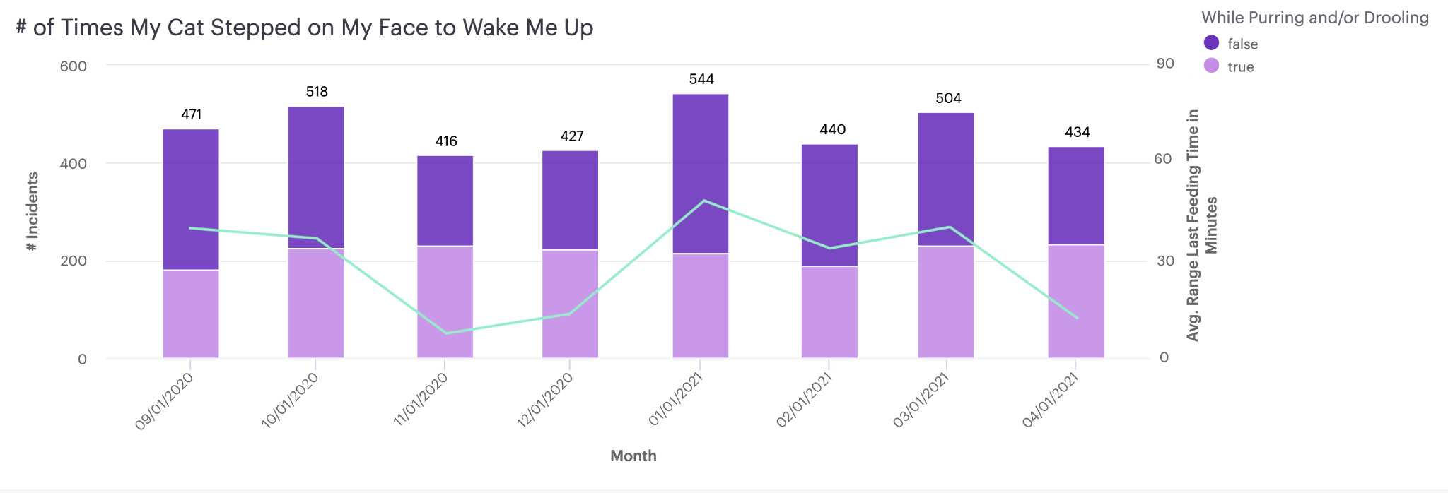
More details about my cat can be found here! And if you have questions, or want to share feedback, comments, or ideas for future exploration, please do so in the thread where my fellow cat-owner and I will see them and respond. Thanks!
____________________________________________________________________________
The aim is to answer the following questions each time:
- “What am I looking at?”
A short-but-informative title can tell people immediately what data is the focus of the insight, for example, data around questions that get asked and answered in our Netlify Support Forum, or Engagement with our CLI. This quickly sets the context for the rest of the insight. - “What should I learn from this?” or, “Why should I care?”
Include the most useful information, and/or a clear takeaway. For folks who only have a few seconds to scan the message, it should be easy to spot the most valuable bit of the insight, the reason this exploration was considered worth sharing. This section should be formatted as bullet points, and putting the key words and numbers in bold calls attention to them. Sometimes there’s only one bullet point, and sometimes up to seven. - “What caught my eye?”
A chart, of course! Even folks too busy to scan bullet points might be able to make time to look at a chart that illustrates one of the salient bits of the insight. Getting someone to look at your chart is the first step toward getting them to read your insight and perhaps learn something new. Having an eye-catching visual makes it more likely that your colleagues will read your message! - “What if I want to know more?”
A link to additional information can be valuable for people who have time for more than a quick scan and want to understand how you developed the insight, or do some of their own related exploration. Linking to a dashboard with additional charts – and the code behind the charts – allows for these self-serve explorations. Capturing the steps you took and the accompanying thoughts and assumptions in a document that can be linked here can take people on the data insight journey with you, which increases opportunities for collaboration. - “What if I have a question?”
Explicitly inviting questions and responses is crucial. It’s the best part of sharing an insight! This is where you get to learn about things your colleagues know that you don’t, or what they’re curious about but hasn’t yet risen to the level of becoming a data request from them. This kind of interaction can inform future explorations, make connections across business functions, and overall increase the data literacy of your whole organization. - “What if posting this prompts a whole bunch of follow-up questions, or exposes incorrect assumptions?”
If you’ve hit on something that’s interesting to a lot of people there likely will be questions that spin off, new ways to slice the data you’re looking at, or assumptions you’ve made that need to be corrected.
Be prepared to welcome such a response, and know how you will handle it ahead of time so you aren’t overwhelmed if it happens. This sets you up for success in continuing to foster an atmosphere of collaboration and partnership with your fellow smart, curious colleagues.
You can even try something like sharing the insight with a knowledgeable stakeholder beforehand, and, if they’re ok with it, tagging them in the insight post as a co-question-answerer. This could be beneficial in several ways, including helping the stakeholder feel good about being a subject matter expert, and keeping the questions you have to answer limited to actual data questions vs. “What happened to the cat feeding schedule in November?” for example. Tagging in others also helps to identify people outside the data team as data power users, an important step in the road to widespread data literacy at your company.
Following these tips for broadly sharing your data insights across your organization facilitates collaboration and mutual learning – increasing data literacy across the company. It also helps remind folks that members of the data team can be strategic partners, creating opportunities for proactive brainstorming that can drive innovation.
How do you all share your data insights with your colleagues? Do you often get to develop and share insights proactively? If so, what are some of the benefits you’ve encountered? I’d love to chat more about this in the Locally Optimistic Slack community – come join the conversation!